Skip to content

Online shopping depends a lot on search. While search engines help customers discover your brand, site search assists in product discovery after they already land on your online website. Do you find your e-store gets low sales? An inefficient internal search system may be the reason. A stellar site search experience brings the right product to the customers in need, so it boosts sales and conversions to a significant extent.
Unfortunately, e-commerce usually provides poor site search support. According to a search UX benchmark by Baymard Institute, up to 61% of all surveyed sites are “performing below an acceptable search performance”.
To suggest some best practices for search UI/UX design, this article follows the user journey from the moment they look for an item until they get the search results. Therefore, all suggestions are both practical and effective. Keep scrolling down to find the best ways to optimize eCommerce site search.
Tips for Designing the Search Box
A search box, or a search bar, is crucial to any online business. In the digital context, there is no store assistant to guide customers or answer their questions. This is where site search comes to help.
Rather than just a nice-to-have function, an internal search system is a must for every online store. More importantly, the conversion rate of online searchers is much higher than average, with 30% of site visitors landing on the search bar after they enter an e-store. Therefore, it's worthwhile to optimize UI/UX for your search box.
Choose the appropriate position
The first consideration of designing a search box is the position. The rule of thumb is to place it on the menu bar, which catches the eye of the customers right after they visit the site. This is also the common position of a search bar, so even new visitors know exactly where to input their questions when they have one.
Depending on the language of the website, the products you're selling, and the design template you follow, you can choose to have the search field on the left, right, or in the center of the header menu bar. Research shows that center position results in 15.86% search usage while placement at the top left performs the worst at 7.72%.
 |
 |
For English-speaking and some other logo-syllabic Internet users, the search bar is usually on the right side. However, in Arabic languages, things are flipped as the Arabian writes from right to left. Hence, you can see the search field on the top left corner in the English version and on the top right corner of the Arabic version of this university's website.
Another tip for a search box’s position is to enable it on every page. This will save time for customers when they suddenly come up with a query but are not on the Homepage. Also, a button to get back to the top is of great help for customers who have been scrolling down quite a lot.

The “up" button on Clark's site brings users to the top of the page where they can find the search bar.
A sticky menu bar can also solve this problem. However, you need to design it carefully so the persistent header doesn't block the viewport. Some useful tips for optimizing a sticky bar are:
- Minimal and concise

The sticky bar on Camilla website has fundamental elements including promotion info, navigation menu plus a search button, language and currency settings, filters and sorting options. All are collapsed by default, so it doesn't take up much space. When customers click on an element, for example, the magnifying glass for search, the complete search field will show up.
- Contrasting colors

With a bright red color in the background, the navigation menu draws a clear boundary between the main page and the persistent header on Katy Perry's e-commerce site. This vibrant color also well matches her style.
- Natural and responsive motions: Animation is not recommended for sticky headers as it’s usually disruptive and possibly slows down your site. The rare case where you should use animation for persistent bars is for the purpose of minimizing. For instance, some elements will shrink down when users scroll down.

The logo and the navigation menu of Michigan.gov shrink down to make the sticky bar smaller. But as you can see, the animation is not so responsive.
Have a prominent search field
A prominent search field can make the search more noticeable, encouraging customers to use it. It's an excellent way to convert visitors into searchers since the latter is more likely to purchase.
Moreover, the search field should be large enough to accommodate common queries of the website. You can find popular search terms in the report of your search apps, like in the Analytics feature of Boost Product Filter & Search. If your search solutions don't have such a feature, the search field should at least fit the products' titles.

The search field in Macmillan Education is quite spacious because they sell books with lengthy names.
To save space, especially for mobile optimization, you’d better opt for a growing search box. The site search now is represented by an icon only and when customers click onto it, it expands.
To add a sense of personal conversing (like that between the shoppers and the store assistants), a short placeholder text can help. Simple microcopies like “Search for products, brands" suggest to customers what they can search for while other creative versions make online shopping a more human-like interaction.

Is “I'm looking for…” what we usually say to the store staff when we need their help? Red Dress has used it as the placeholder text for the search box. A great idea to make the site search experience less robotic.
Other elements to include
Although there is no research about the efficacy of the magnifying glass in the search field, it's widely accepted that all site search bars must have this universal icon for search. The color can be changed to match the brand identity, but the simple magnifying glass always accompanies the search bar.
Also, the magnifying glass icon can be integrated with the search button to serve some users who have a habit of hitting the traditional “submit” button to get the search results.
How to make magic with the Instant search widget
Is it necessary to have an Instant search widget?
First of all, the search box and the Instant search widget are two different things. While the former is simply the search field with a search button, the latter is a drop-down box that is used for the search-as-you-type function. This means only when customers type something does the instant widget show up.
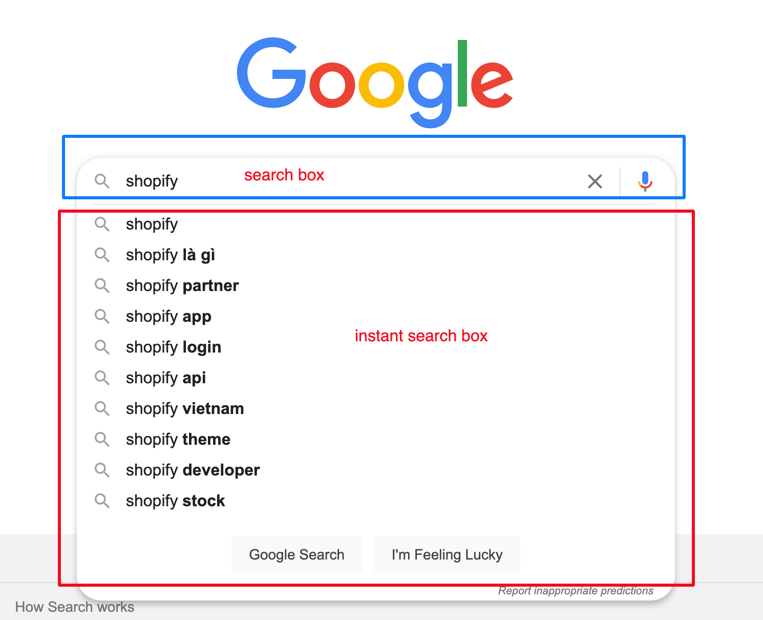
External search engines like Google have made Internet users accustomed to the search-as-you-type function and the Instant search widget.
The Instant search box shortens the search journey. Customers don't need to type the whole lengthy queries thanks to instant suggestions. They can also find the exact product in the drop-down instead of visiting the search result page. Thus, 96% of major e-stores offer an Instant search box.
Fundamental functions for Instant search box
In an e-commerce context, the Instant search box should suggest more than just search queries. The instant suggestions can include products, collections, pages, and even blog articles. Online customers may wonder about the shipping and returning policy or how to use your products, so pages and articles will come in handy in these cases.

An efficient site search should instantly suggest products and more. (Source: Boost's Demo site)
Fuzzy search or the “Did you mean" feature is also necessary for the instant search box to perform well. It takes care of typos, which are common in the digital context, and doesn't require customers to delete the query and input again when they mistype something.
To enhance search UX, Synonyms and Redirects are another combo that you should use to empower your site search.
How do you feel when you search for “beachwear" but it returns only a handful of products and the results for “bikini" are triple that number? Are “beachwear" and “bikini" in the same category? A drawback of basic search solutions is that it only returns products based on matching attributes. So if “beachwear" is not in the titles, descriptions, etc. of “bikini" items, “bikini" will not show up in a search for “beachwear". Synonyms help to resolve this drawback as it merges the search results for search terms you set.
Redirects are set up to auto-direct searchers to a certain page or collections. For example, when customers search for “returning policy", the normal search result will normally have no product due to the mismatch in product attributes (we don't think there’s any item with the name “returning policy"). However, when Redirects is in use, customers are brought to the policy page after hitting enter or clicking the “submit" button.
Advanced functions
With the lightning-fast advancements of technology, customers are requesting a real-life experience in the digital space. To satisfy these demanding shoppers, visual search and voice search have been invented.
While voice search and visual search are still unpopular in the world of e-commerce, many tools have been developed to make it possible for searching by voice orders or finding matched items in an image. The question is when these tools will be integrated into selling websites.

Increase conversion with UI/UX optimized Search result pages
The search results page is the end of the search experience. It can be the last chance to turn searchers into buyers, so you should pay adequate attention to it.
Always have a filter tree and several sorting options
The returned products for a search can be a few and can also be a lot, depending on the query. That’s why you’re better off enabling a default filter tree in the search results page. It's useful for customers to narrow down the matching results and find suitable items.
We have a detailed article about UI/UX tips for filter design, don't forget to check it out. Here is a summary to build a perfect e-commerce filter:
- Choose appropriate facets or filter options
- Enable Multi-select filter with various sorting options
- Avoid industry jargon and ambiguous names
- Have collapsible filters with a search box
- Allow customers to quickly edit the filter
Some sorting options also help e-shoppers quickly view the products in their preferred order. For example, a fashionista will want to see Best Sellers first, while a price-sensitive customer will sort by Price (from Low to High).

Choose a proper product layout
To remind customers of their search (in case they have something else to do and come back with no memory of what they were doing), you should keep the original search query at the top of the search result page.

Another important consideration is whether to use list view and grid view for the product list. From our experience of working with more than 10,000 Shopify merchants, we have some interesting insights to share:
- List view: suitable to show product details. If specifications are an important aspect for shoppers to make a purchasing decision, you should use the list view to showcase as much information as possible.
- Grid view: is the best option to enhance the product visuals. Fashion e-commerce stores usually use this view to help customers picture how the item looks.
 |
 |
Amazon uses list view when searching for digital devices like “television", but grid view for “dress”.
The number of items in the product list at once can also be optimized. The usability test by Baymard indicates that the average number of products to be loaded at once on the desktop is between 50 and 150 per scroll. On the mobile screen, the ideal number is around 2-4 items visible within a viewport.
Leverage No search results
“No products found" is a bad ending in the search journey. If you just leave it like this, customers will just switch to a competitor's site to look for the product they want. Indeed, there are some tactics for you to reverse the dead-end and keep shoppers hanging around or even coming back.
Related: Tips instant results not working
The first thing you can do is to point out the reasons for no search result. It may be due to misspellings, in which case customers can go to the search bar and type the query again or simply click the suggestion term in the “Did you mean…” feature. If no results happen because your store doesn't have the product, you should provide customer support details so customers can send a request for the item. This can help you understand your target audience's needs. Multiple requests for one product are a signal for you to make it available on your online store.

Red Dress has made an excellent No search result page with suggestions and contact points for product requests.
If your store does have the item but it is out-of-stock, let customers know when it's back in stock or ask them to leave their emails so when the item is back in stock, they are notified.
Another approach in case of no search results is to suggest other products. Best selling items, new arrivals, or recently viewed products are all better than a blank page.

Still, you're better off preventing no search results from occurring. This can be done by identifying and analyzing queries that lead to that dead-end. A search Analytics tool like ours can help you with this. After that, you can have an action plan to solve it. Build broader synonyms if no result happens due to differences in search queries and product data. Or consider selling products that customers search for but your store doesn't have.
Recap
Search is an imperative element to boost online conversion. Therefore, its UI/UX design should be optimized to encourage visitors to perform and complete a site search. You can find the best practices for every step of the search journey from the search bar to the search page in this article. Implement them right now to see a real surge in search usage and conversion rate. We'll come back soon with more tips for e-commerce growth.