Skip to content

Search is the fastest and most effective way to convert visitors into buyers. An eCommerce store without enhanced search functionalities is a surefire way to failure. Before applying state-of-the-art technologies like NLP and machine learning to your site search engine, you should never neglect the search UI/UX in the instant dropdown or the search autocomplete.
This is the very first interaction between potential buyers and the site search. Doing it wrong is like leaving a terrible first impression, which can cause customers to bounce and never come back. So you’d better make it as smooth and user-friendly as possible. Here are the top 8 design tips you should use when building the interface and the experience of the search widget.
Tip #1: Use the placeholder text and common visual hints wisely
Search has been a popular online activity since the dawn of the internet. As a result, there are some universal UI guidelines you should follow to avoid confusing customers.
First and foremost, the placement of the search bar should be at the top-center or the top-right corner of the page. Research shows the center position achieves the highest search usage of 15.86%. On the other hand, placement at the top-left led to the worst result at 7.72%.
However, you need to take into account the mother tongue of your customers too. For example, in Arabic languages, people read things from right to left, so it’s better to place the search bar on the left side to catch their attention.
 |
 |
You can see the search field in the top-left corner of the English version but it is switched to the top-right corner in the Arabic version of this university's website.
👉 👉 Read on How to design an UI/UX optimized search journey from the search bar to the search page on e-commerce stores.
Regardless of the position, one visual hint for the search bar we all agree on is the magnifying glass icon. This icon or the word “Search” should be added to the search field to indicate that users can go to the search results page by clicking it. You should also allow shoppers to achieve this by hitting “Enter” on a keyboard, or “Go”/ “Search” on a mobile keyboard.
On the autosuggestion dropdown, it's a plus point for UI/UX when you show a link at the end of the suggestions. This helps to indicate that there might be more results on the search results page.

(Source: Crocs - a user of Boost Product Filter & Search)
The placeholder text is another key position to communicate with shoppers. You can use it to guide visitors on what they can search for. We find that many e-Commerce stores allow looking for product SKUs. However, customers are not aware of that. In this case, using a placeholder text like “Search for products’ name, SKU, etc” will be of great help.
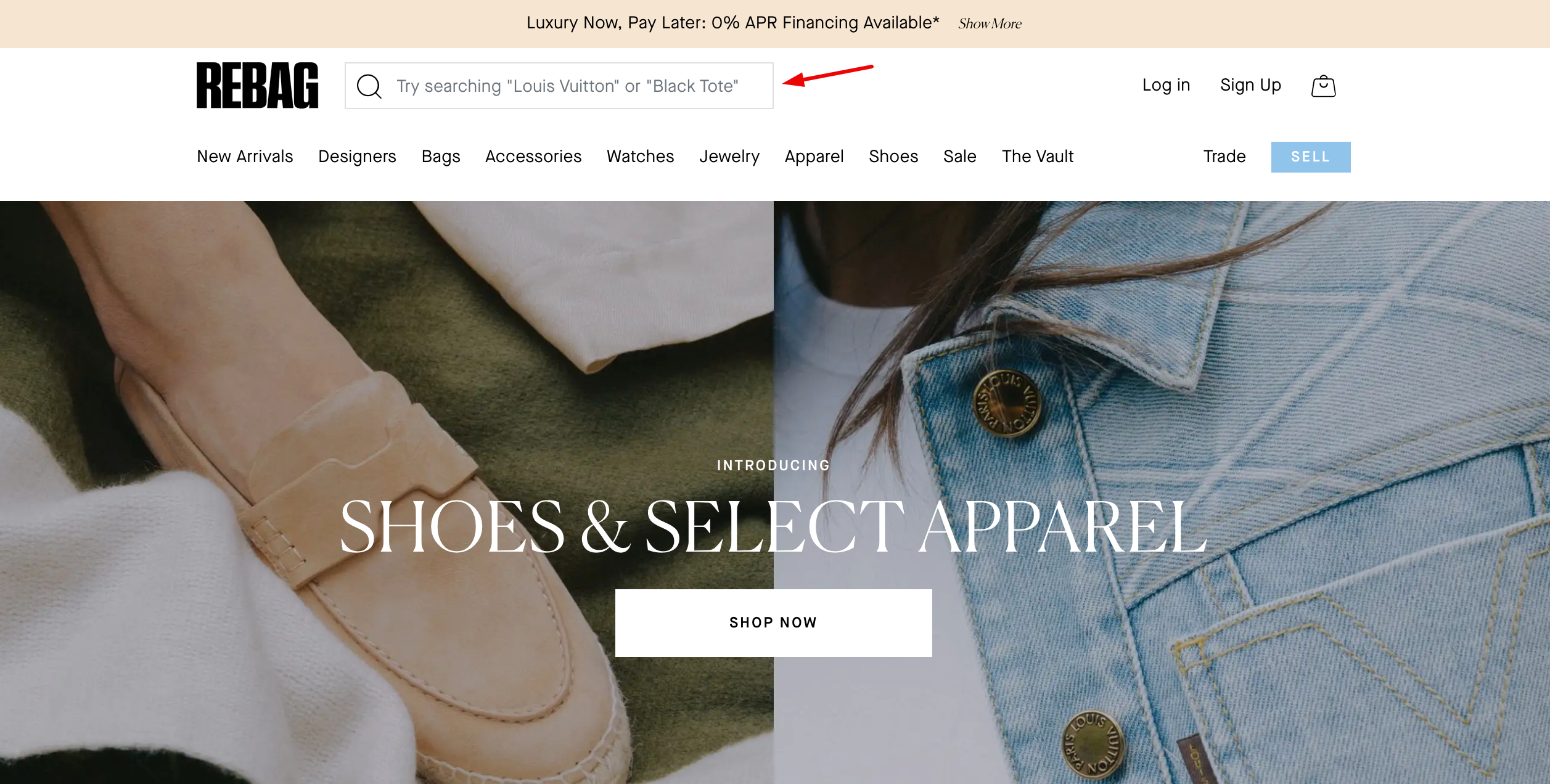
Rebag - a Boost user - gives some examples for the queries on the search field.
Tip #2: Enhance visual depth on the search autocomplete design
Your website definitely doesn’t have only the search feature. The homepage carousel, the neighboring banner, and many other webpage components can vie for the user’s attention and interfere with their searching journey.

Visual depth on the instant search widget gives it a little more weight when surrounded by distracting elements. Including a border for the autocomplete dropdown is a simple way to avoid being blended with the background. However, it doesn’t make the search prominent enough.
You should consider adding a subtle shadow or dimming the background to make searchers focus on the autocomplete feature and “move more smoothly into product exploration” according to Baymard.

Boeing Store darkens the background when customers use the instant search feature.
Another way to keep the user’s full attention to search is to use the overlay full-width layout.

👉 👉 Visit our Demo site to learn more about this instant search layout.
Tip #3: Keep the number of suggestions short and sweet
Hick’s law is a common concept in UI/UX design. Its idea basically is the more choices there are, the longer it takes to pick one. That’s why it’s harmful when you put a whole lot of suggestions in the instant search widget.

The ideal number in the instant results is no more than 10 items. On mobile, so as not to overflow the user’s viewport, this number should be shortlisted to 4-8. By doing so, shoppers can get an overview of their choices.
If your search returns results in different scopes such as term suggestions, product suggestions, pages & blog posts, you should adjust the number of suggestions in each category depending on the context. For example, product suggestions should take the lead when customers browse your homepage.

Customize the instant search display in Boost Product Filter & Search. Try it yourself in a 14-day free trial. Access to all features including powerful storefront filtering and merchandising.
Scroll paradigm in search autocomplete is not recommended either. Having all suggestions manageable and visible at once is the best choice as inline scrolling can cause unintentional clicks, scroll hijacking, and obscured content.
Tip #4: Differentiate between the original input and the rest
Basically, the autocomplete terms in the search dropdown combine the query entry with a related predictive suggestion. Many eCommerce sites do not make a distinction between these 2 parts, which burdens the visual load for the searchers. In this case, they need to scan through the suggestions one by one to identify the best match.
Some other stores make the mistake of highlighting the repetitive characters the customer has entered in each and every autocomplete suggestion. This brings the shoppers' attention to the original query that they already know.
The search UI/UX tip you should apply here is to make the predictive components bold. It will:
- draw shoppers’ attention to the query possibilities
- assist them in “filling in the blanks”
- allow them to skip over repeated terms and spend less time reading.

Highlighting the differences in the suggestions is good for search UI/UX. (Source: Red Dress - a Boost user)
Tip #5: Highlight the search suggestion on hover
Customers tend to skim through the list of suggestions. Therefore, clearly identifying the active suggestion - the one they are looking at - is a plus point for UI/UX. It keeps the shopper on track and avoids mis-clicking.
Many Internet users are also used to keyboard navigation as a result of using well-known search engines like Google. Without the highlight, customers won’t know where they are on the suggestion list when using their keyboard for navigation. This also helps you comply with Accessibility guidelines, which are crucial in some American states.

On hover or navigated by keyboard, the active suggestion on Orka will change the color and have background shading for emphasis.
Additionally, you should think about using the “hand cursor” when the user hovers over the autocomplete recommendations. This makes it crystal clear that clicking these links will launch a search results page.
Tip #6: Allow for clearing queries and closing the search dropdown separately
Some users will alter their search strategy mid-query in an effort to end the search and remove the autocomplete suggestions from their path. Therefore, you should include a close (x) button in the form of an icon or text.
Also, it’s a UI/UX upgrade to allow searchers to end the search experience and close the product suggestion dropdown. A simple click on the background should be enough to let customers achieve this.
 |
 |
(Source: Camilla)
When using a full-width layout for the instant search widget (meaning there is no “background” to click when users want to exit the search suggestions), you should have a secondary close button to perform such action.

The full-width search layout on Boost Product Filter & Search.
Tip #7: Implement visual merchandising on the search autocomplete
In the age of digital marketing, visual merchandising is a key factor to boost sales. The instant search widget offers product suggestions and search autocomplete, which can be very useful for visual merchandisers.
Just by showing the product images in the search dropdown, you give the shoppers a preview of what they are about to purchase.This helps them in their decision-making process. By seeing the product, shoppers get a better idea of whether or not the style might fit them well. Alluring imagery in the instant search is a shortcut to lead customers to the product page. They can then explore the item in detail and finally purchase it.
 |
 |
With just one single click, you can show product images in the search autocomplete as in Miss Amara.
Tip #8: Predictive search UX guidelines for mobile-readiness
Mobile commerce is a huge trend in the world of e-commerce. The main reason is that consumers are always on the go. They want to be able to access their favorite brands from any place and at any time. That’s why we dedicate a section for mobile optimization with the instant search widget.
When it comes to small screen devices, the top priority is readability. As a result, you should narrow down the number of suggestions as we mentioned in Tip #1.
The mobile testing conducted by Baymard also indicated that users found it challenging to see and choose the autocomplete in small letter sizes. Additionally, when small text sizes and insufficient space were coupled, it led to mistaps that confused shoppers when they arrived at unexpected results pages.
The rules of thumb for search UI/UX readability on mobile are:
Also, you should completely avoid truncating suggestions. Truncation barely leaves users with a possible way to view the entire predictive terms as they usually miss the vertical scrollbar on mobile devices. Using text wrapping is a better choice here.
Unlike desktop users, mobile users are accustomed to scrolling up and down. Therefore, a scrollable search widget is quite acceptable on mobile. However, you should make it clear that shoppers can scroll to see more suggestions. Providing users with subtle scroll indicators might help them realize that there's more to view.
Have you optimized the search UI/UX in the instant dropdown?
UI/UX optimization is the key to eCommerce conversion. The first impression usually lasts the longest, so make sure you spend resources to design an optimal search autocomplete widget. Simply investing in a third-party app like Boost can help you quickly handle all these things. Grab your free trial now and let the sales tell.